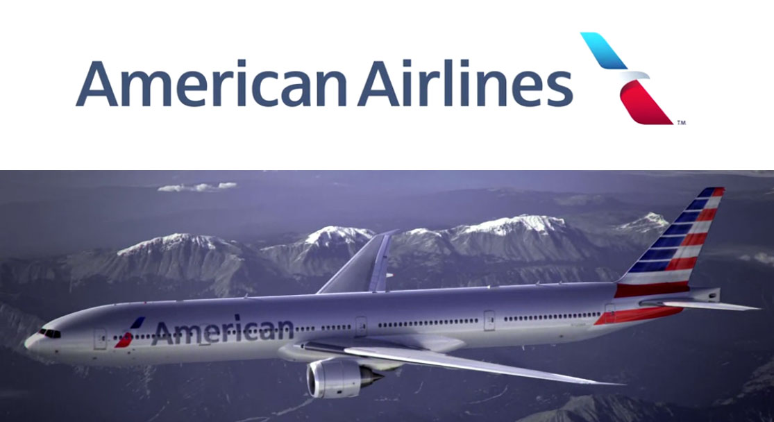
The new American Airlines logo revealed in a film here that looks back at AA history and logos too, is a clean crisp update withe the eagle intact but abstract. The tail of American Airline planes look decidedly patriotic as they are drenched in the red white & blue stripes.
So while the logo update may be the most modern facelift they ever had, will it be able to yank AMerican Airlines away from the bankruptcy protection they are in?
The unions are not impressed, as a spokesperson for the Allied Pilots Association told the Chicago tribune
"A new paint job is fine but it does not fix American's network deficiencies and toxic culture, so we continue our steadfast support of a merger with US Airways and not doubling down on the network strategy that brought us into bankruptcy," said Dennis Tajer, spokesman for the Allied Pilots Association, which represents American Airlines pilots. "American's network needs more than cosmetic changes to compete with Delta and United; simply put, it needs to merger with US Airways now."
Seriously? Does anyone need anything to compete with United? I would fly them again if they paid me a million dollars. Similarly, Delta has been a harrowing experience as of late. Airlines might want to look at their customer service first, ipads in cockpit and updated logos later.

I built this website. From scratch. Including the servers.
Adland® is a commercial-laden heaven and hell for advertising addicts around the world.
This advertising publication was founded in 1996, built on beer and bravery, Adland® now boasts the largest super bowl commercials collection in the world.
Adland® survives on your donations alone. You can help us out by buying us a Ko-Fi. Adland® works best in Brave browser