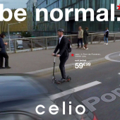
A lot of fashion brands are using the same typeface. Spanish clothing brand Desigual has found a way to stick out. To launch its new “Forwards Is Boring” campaign, developed in partnership with Amsterdam based ideas company, WE ARE Pi, Desigual permanently reversed its logo.
Desigual, Chief Marketing Officer, Guillem Gallego described this move thusly: "The objective of the campaign, in addition to presenting the company’s surprising new image which makes it the first international brand to permanently rotate its logo, is to invite people to think. To make them feel awkward. To make them step outside of their comfort zones. Which is exactly what we’ve done.”
The campaign will make its premiere in social media as well as outdoor street marketing in major European cities. It's hard to read. But they are hoping it is just as hard to ignore.
And while it may be true that Desigual is the first to permanently reverse its logo they are by no means the only brand that has done this on their apparel. .


Client: Desigual
Agency: WE ARE Pi

Adland® is a commercial-laden heaven and hell for advertising addicts around the world.
This advertising publication was founded in 1996, built on beer and bravery, Adland® now boasts the largest super bowl commercials collection in the world.
Adland® survives on your donations alone. You can help us out by buying us a Ko-Fi. Adland® works best in Brave browser