
If you are font-obsessed enough to get annoyed by all the Gill Sans because it's all wrong in an American ad agency of the 1960's, you'll love that Mark Simonson - bless - has dissected all the font wrongs of Mad Men. Yes, Gotham, ITC kabel, Zapfino and even Gill Sans should not be there.
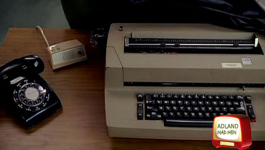
We know that the show isn't historically accurate, heck, they had that IBM Selectric from 1961 already in 1960, but it's nice to know that I'm not the only one obsessing over the tiniest details. Meanwhile, Andrew Hearst covers the thoughtless choice of Arial in the ending credits. At my house, the offspring plays the game of "spot the stuff mommie actually has" and so far she's seen my blue Boylan Seltzer bottle in the show and a few pieces of furniture. "look mom! Yours!"
I built this website. From scratch. Including the servers.
Adland® is a commercial-laden heaven and hell for advertising addicts around the world.
This advertising publication was founded in 1996, built on beer and bravery, Adland® now boasts the largest super bowl commercials collection in the world.
Adland® survives on your donations alone. You can help us out by buying us a Ko-Fi. Adland® works best in Brave browser


- reply
Permalink- reply
Permalink- reply
Permalink- reply
Permalink